
That’s a mouthful, but let me explain – I needed something that would do it all. For Black History Month 2023, we wanted to have a glow-up on the old, ordinary resource sections and reading lists of the past and replace it with something that would be feel fresh on every arrival whilst containing all of the information that we wanted to share.
🧱 Building the wall
🚧 Structure
I’ve had mixed feelings about Masonry.js in the past. It’s great, and I appreciate Bootstrap 5 putting their hands up and saying card-columns was beat. But I feel that card-columns was the light CSS brush that was required sometimes. I spent a morning integrating Masonry into this project and just come across issue after issue, so it’s not like I didn’t give it a try, honest!
The row-cols-md-# also had problems when combining with the rest of the requirements, as it makes each of the cards in the row equal height and not the patchwork style, so I went back to Bootstrap 4 and borrowed the card-columns that were discontinued. A simple, CSS solution to the clashes I was having.
<div class="card-columns" id="shuffle">
<div class="card all books-articles-papers bhm-fade-in">
<img loading="lazy" src="SRC" class="card-img-top ku-aspect-3-5" alt="ALT">
<div class="card-body">
<p class="card-title h5">TITLE</p>
<p class="card-text">DESCRIPTION</p>
</div>
</div>
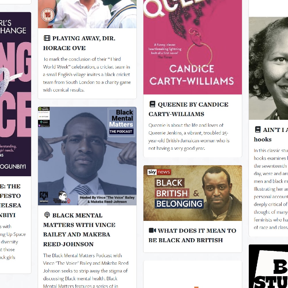
... and repeat for each cardThe parent div has the class card-columns and the ID of shuffle, and each card has a couple of important classes: all, their filter class(es) (like books-articles-papers) and the intersection observer class bhm-fade-in. Also important to note is the loading="lazy" is used in conjunction with a CSS aspect-ratio class to prevent Content Layer Shift (CLS), as it’s given the designated space required on-load, whilst maintaining higher performance.
The lightly modified CSS for card-columns in Bootstrap 4:
@media(min-width: 576px) {
.card-columns {
-webkit-column-count: 2;
-moz-column-count: 2;
column-count: 2;
-webkit-column-gap: 1.25rem;
-moz-column-gap: 1.25rem;
column-gap: 1.25rem;
orphans: 1;
widows: 1;
}
.card-columns .card {
display: inline-block;
width: 100%
}
}
@media(min-width: 992px) {
.card-columns {
-webkit-column-count: 4;
-moz-column-count: 4;
column-count: 4;
-webkit-column-gap: 1.25rem;
-moz-column-gap: 1.25rem;
column-gap: 1.25rem;
orphans: 1;
widows: 1;
}
}
.card-columns .card {
margin-bottom: 1.5rem!important;
text-decoration: none;
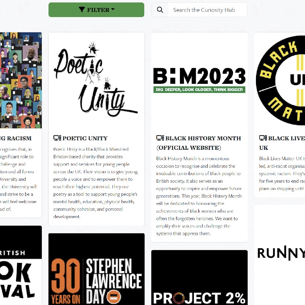
}🔍 Searching and filtering
Within a small space, I wanted to incorporate multiple filters and a key-up search bar that automatically displayed cards containing the string.
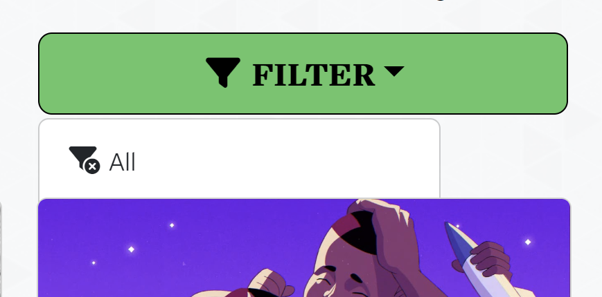
The first step was to set up the HTML for the filter buttons and the search input. Initially, I used buttons for the filters but we kept adding more and more so it become quite messy. Instead, I settled on a dropdown.
Each button uses a data-filter="" attribute for their respective card-classes they’re looking for, and has the class category-button which is called by the JavaScript.
<div class="row">
	<div class="col-md-6 mb-3 mb-md-0">
		<div class="dropdown d-grid">
			<button class="dropdown-toggle btn btn-lg bhm-btn-green white-space-normal" type="button" data-bs-toggle="dropdown" aria-expanded="false">Filter</button>
			<ul class="dropdown-menu">
				<li><button class="dropdown-item category-button" data-filter="all">All</button></li>
				<li><button class="dropdown-item category-button" data-filter="news">News</button></li>
			</ul>
		</div>
	</div>
	<div class="col-md-6">
		<div class="input-group text-center input-group-lg">
			<span class="input-group-text" id="searchCuriosity">
				<i class="fa-solid fa-search" aria-hidden="true"></i>
			</span>
			<input type="text" class="form-control" placeholder="Search the Curiosity Hub" id="curiositySearch" aria-label="Search the Curiosity Hub" aria-describedby="searchCuriosity">
		</div>
	</div>
</div>
Next, the JavaScript for the filter buttons. This creates an array of all the category-button buttons and gets their data-filter on click. If data-filter="all", it displays all the cards, but, if not, it only displays cards with the corresponding filter class.
$(document).ready(function() {
	var categoryButtons = document.querySelectorAll('.category-button');

	categoryButtons.forEach(function(button) {
		button.addEventListener('click', function() {
			var filterValue = button.getAttribute('data-filter');
			var allItems = document.querySelectorAll('.all');

			if (filterValue === "all") {
				allItems.forEach(function(item) {
					item.style.display = 'inline-block';
				});
			} else {
				allItems.forEach(function(item) {
					if (!item.classList.contains(filterValue)) {
						item.style.display = 'none';
					} else {
						item.style.display = 'inline-block';
					}
				});
			}
		});
	});
});
Very similar for the jQuery key-up search, it hides all cards that don’t match the input. I previously wrote this search bar for Bootstrap 4 and the website still has jQuery for other functionality, so I didn’t need to update the function. It could just as easily be written in vanilla though.
$(document).ready(function() {
	$('#curiositySearch').on('keyup',function() {
		var valThis = $(this).val().toLowerCase();
		if(valThis == "") {
			$('.all').css('position','initial');
			$('.all').show();
		} else {
			$('.all').each(function(i,item){
				var text = $(item).text().toLowerCase();
				console.log($(item).find('a').text());
				if(text.indexOf(valThis) >= 0) {
					item.style.display = 'inline-block';
				} else {
					item.style.display = 'none';
				}
			});
		}
	});
});
👀 Intersection observer
A very basic but efficient intersection observer, this triggers adding the class bhm-active when an element with the class bhm-fade-in comes 20% into frame. This process is not run until after the news feed is formed.
function runObserver() {
	const elements = document.querySelectorAll('.bhm-fade-in');

	const options = {
		root: null,
		rootMargin: '0px',
		threshold: .2
	}

	const callbacks = (entries) => {
		entries.forEach(entry => {
			if (entry.isIntersecting){entry.target.classList.add('bhm-active');}
		});
	}

	let observer = new IntersectionObserver(callbacks, options);

	elements.forEach(element => {observer.observe(element);});
}
The CSS for the bhm-fade-in and bhm-active classes is:
.bhm-fade-in {
	opacity: 0;
	transition: all 2s ease-out;
}

.bhm-active {
	opacity: 1;
}
A clash of z-index, opacity changes and transforms stumped me for a while. Originally I also had a transform to move upwards accompanying the opacity change, but the dropdown was opening behind the cards, even though it’s z-index was highest. This led me down a rabbit hole learning about how positioning, opacity, transformation and z-index create a more complex stacking order than most realise.
📰 News feed and shuffling
An extra quirk of this project, which most won’t want to implement, was the integration of an API news feed. Pulling through two categories in the request, the data is looped to create cards with the news filter and bhm-fade-in classes.
After this, the shuffle and observer functions are run. This allows all cards to be in DOM before running either, else it would place the news cards together at the end and none of them would fade in.
$("#shuffle").html($("#shuffle .all").sort(function(){
	return Math.random()-0.5;
}));

runObserver();
🎉 All together now
I’m really happy with the effect this wall has. From the gentle fade in to the fresh feeling on revisiting the page and it being different, whilst still being able to search and filter for that useful or interesting resource to revisit. The page has had hugely positive feedback, and during Black History Month many people suggested their own ideas for things to add which was what I hoped.


🔗 Resources
Here’s some links to the pages I used to help guide the creation of this hub:
- W3Schools jQuery filtering keyup search
- JavaScript data-filters to filter divs
- Filtering cards in Bootstrap 4
- Z-index issue with transform
- What no-one told you about z-index